What Is Victory?
Victory is a ReactJs Library. It is a collection of composable and reusable components for building interactive data visualizations.
Why Use Victory?
One of the main benefits of using Victory is its customizability. The components can be altered, wrapped, or created from scratch, proving to be very beneficial to developers.
Compared to other popular data visualization libraries like Plotly and D3, Victory has user-friendly and intuitive documentation. Even a person with a minimal programming background can easily use it. As far as its UI is concerned, it will immediately catch your eye with its stylishness, interactiveness, and smooth animations.
One of its drawbacks is being limited to only React, unlike Plotly which can be integrated with Python, React, MATLAB, Jupyter, etc.
Getting Started
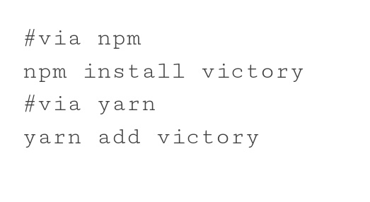
To get started, Victory needs to be added to your project.
Creating A Graph
Now that you have added Victory, you can import it in your project. Victory has a wide variety of charts and graphs. For this blog, we are going to use bar graphs to provide an effective introduction.
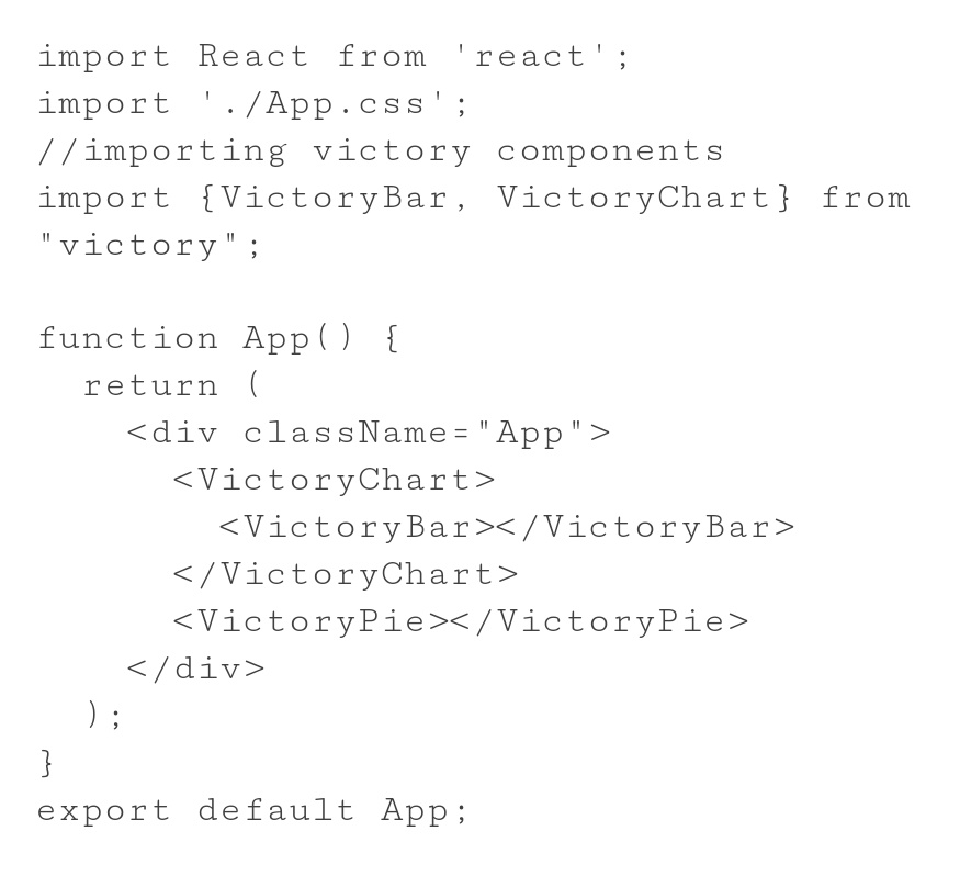
With the above code, you will get the following bar chart on your page, after starting the npm server.
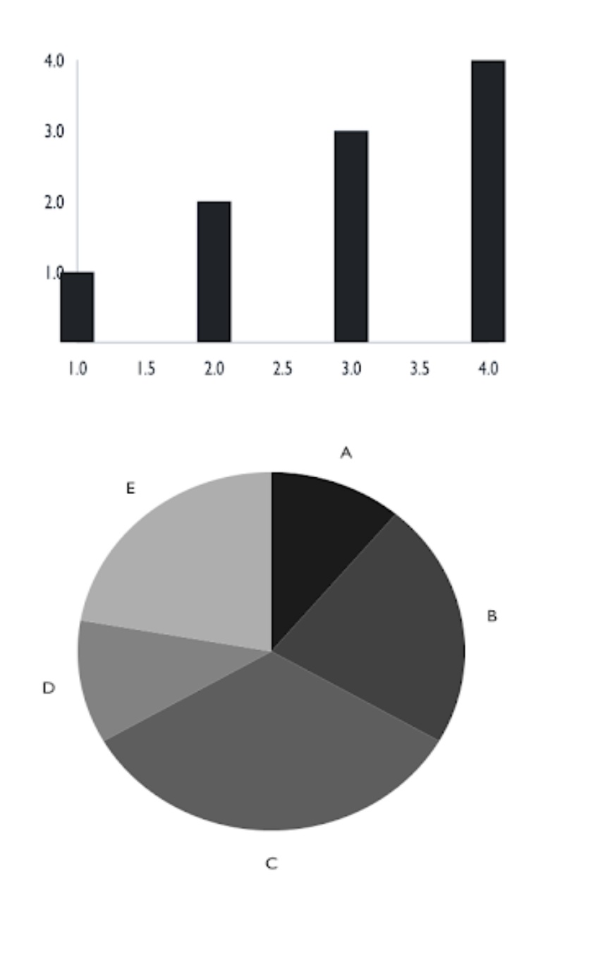
You will notice 2 things:
Even though no data was provided you still get a bar chart with values. This is because Victory uses some dummy placeholder values. Think of it as Loren Ipsum for charts and graphs. You did not need to wrap the VictoryPie component inside VictoryChart. This is because it provides graphed data along with the graph axes but VictoryBar just provides the graphed data.
Providing Custom Data
If you want to actually feed the charts and graphs with your own data, you will need to pass a data property with properly formatted data based on the chart or graph you’re using.
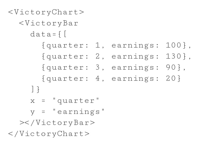
With the above code, you will get the following bar chart on your page.
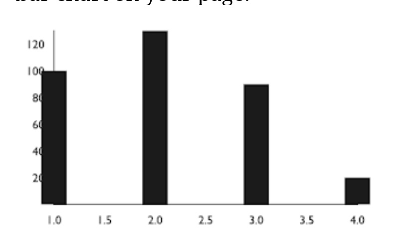
In the above data, the x-axis is referred to as quarter and y-axis as earnings. You can skip this part and keep it x and y for simplicity.
Naming Axes
Let’s take advantage of the VictoryAxis component to display what each axis on the chart is referencing. One axis will display the label “Earnings” while another will display the label “Quarter”.
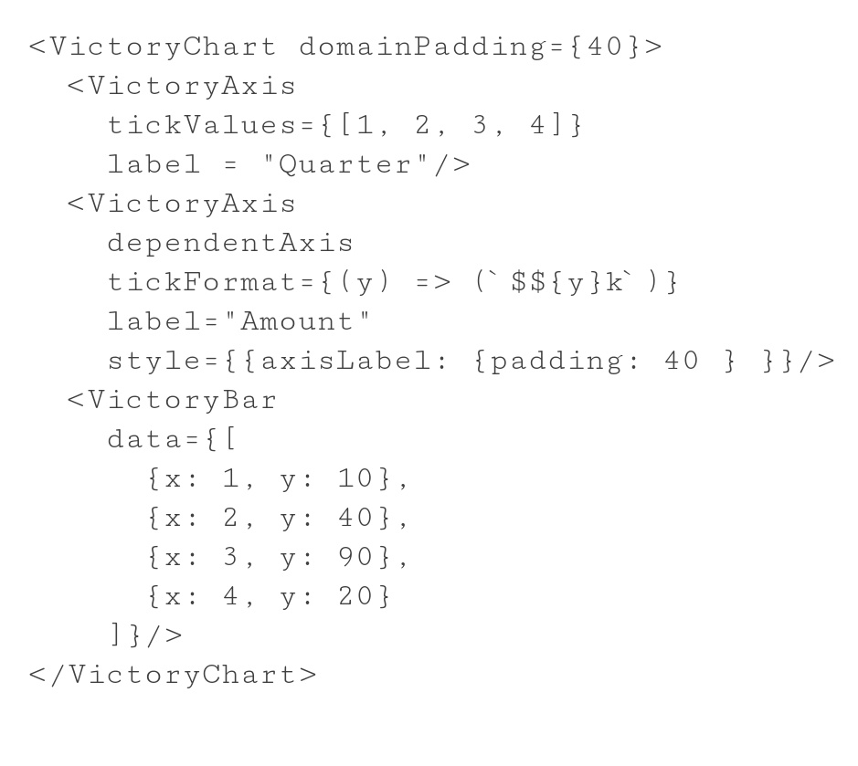
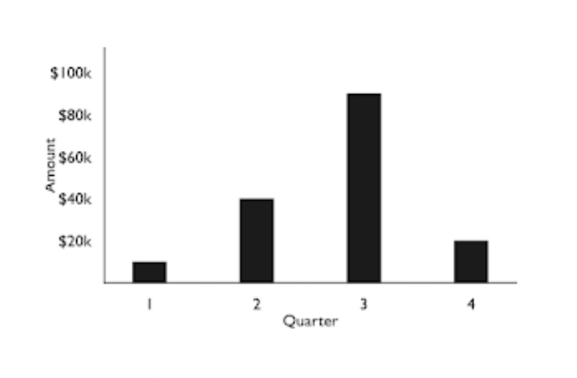
Using VictoryAxis you can label the axes, as needed. You can also provide tick values format and custom styling to each axis. Using the ‘domainPadding property’ of VictoryChart you can shift the bars that were earlier overlapping with the Y-axis.
With the above code, you will get the following bar chart on your page.
Styling Charts
Victory charts come with a default ‘grayscale’ theme so that all components look clean and consistent. Let’s switch it up with the Victory provided ‘material’ theme. We can do that by importing VictoryTheme and adding a theme property to VictoryChart. Themes should always be applied to the outermost wrapper component in a chart.
theme={VictoryTheme.material}
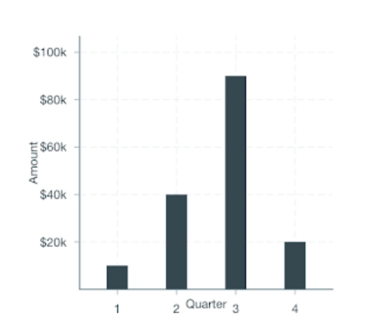
Other properties like borders and colors can also be customized using style property. Default is set to ‘grayscale’ theme.
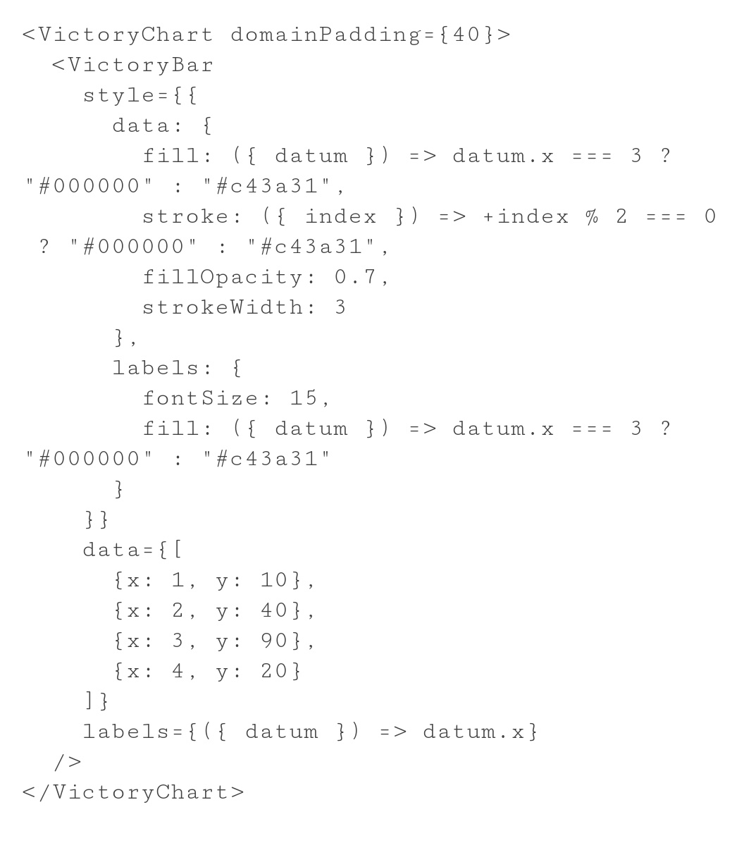
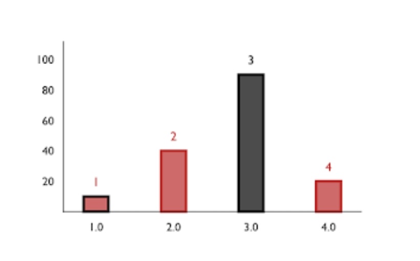
Many more properties like ‘barWidth’, ‘alignment’, ‘barRatio’, ‘cornerRadius’ can also be altered.
Scales
VictoryBar uses standard scale property. Options for scale include ‘linear’, ‘time’, ‘log’, ‘sqrt’, and the D3-scale functions that correspond to these options. The default scale is set to linear.
Animation
VictoryAnimation is able to animate changes in properties using D3-interpolate. Victory components define their animations via the animate property. Duration, delay, easing and onEnd functions may all be specified via the animate property.
Stacked Bar Graphs
VictoryStack can be used to stack multiple bar graphs on each other in a single chart.
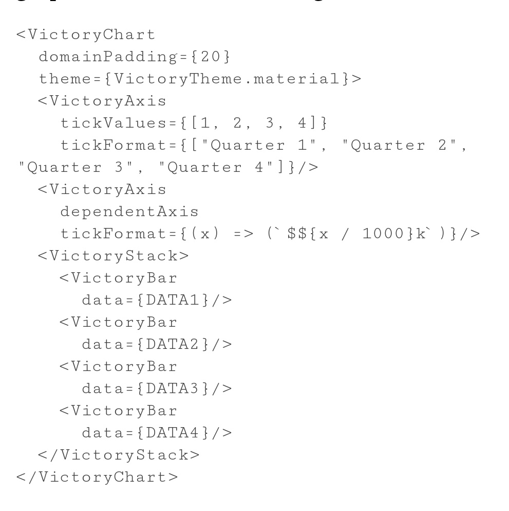
It is to be noted that the naming of X and Y axes in all the 4 data should be the same.
Conclusion
The above discussed are just a few properties for customizing and making your own Victory Chart. Victory offers not just bar graphs but also pie Charts, polar graphs, scatter charts, line charts etc.
You can also club multiple types of graphs in a single chart to make your visualized data more interesting and readable.
| For a further description of properties and charts, refer to Victory | Getting Started |
Signing off,
Vaibhav Sethia
Github Handle: VaibhavSethia
